Announcement

Collapse
No announcement yet.

British aggressors unveil olympia logo

Collapse
X
 
  • Filter
  • Time
  • Show
Clear All
new posts

  • #76
    China's isn't bad:

    Captain of Team Apolyton - ISDG 2012

    When I was younger I thought curfews were silly, but now as the daughter of a young woman, I appreciate them. - Rah

    Comment


    • #77
      Pretty generic.

      Comment


      • #78
        Re: British aggressors unveil olympia logo

        Originally posted by BeBro
        Just look at it, it looks a bit like Hitler, doesn't it? I mean that thing in the middle is clearly his moustache, and the big thing above is his hair parted to one side.
        lol

        Originally posted by Cort Haus
        It's Lisa Simpson sucking off Bart.
        LOL

        Comment


        • #79
          As the vast no. of amateur entries to the BBC News website show, this logo should so have been the winner of a National Competition.

          So much progress in Britain during the Victorian period was down to prizes to do this, that or the next thing, we need to get back to that and making other countries our colonies.

          Comment


          • #80
            Originally posted by kittenOFchaos
            we need to get back to that and making other countries our colonies.
            Yes, Basra was a roaring success.

            Comment


            • #81
              It would of been worse had Sir Keith Mills designed their flag... he should be stripped of his title.
              Monkey!!!

              Comment


              • #82
                Originally posted by Frozzy
                Pretty generic.
                Yea, which makes it not bad.

                Actually being good is a different story.
                Captain of Team Apolyton - ISDG 2012

                When I was younger I thought curfews were silly, but now as the daughter of a young woman, I appreciate them. - Rah

                Comment


                • #83
                  Originally posted by OzzyKP
                  China's isn't bad:

                  That's Beijing 2008's bid logo. For reference, this is London 2012's bid logo:


                  And here's Beijing 2008's Games logo:
                  B♭3

                  Comment


                  • #84
                    Generally, two sets of logos are used--one for the bid process, the other for the games.

                    Atlanta 1996 bid:

                    Atlanta 1996 Games:

                    Sydney 2000 bid:

                    Sydney 2000 Games:

                    Athens 2004 bid:

                    Athens 2004 Games:
                    B♭3

                    Comment


                    • #85
                      Originally posted by Q Cubed
                      Atlanta 1996 bid:
                      DISCLAIMER: the author of the above written texts does not warrant or assume any legal liability or responsibility for any offence and insult; disrespect, arrogance and related forms of demeaning behaviour; discrimination based on race, gender, age, income class, body mass, living area, political voting-record, football fan-ship and musical preference; insensitivity towards material, emotional or spiritual distress; and attempted emotional or financial black-mailing, skirt-chasing or death-threats perceived by the reader of the said written texts.
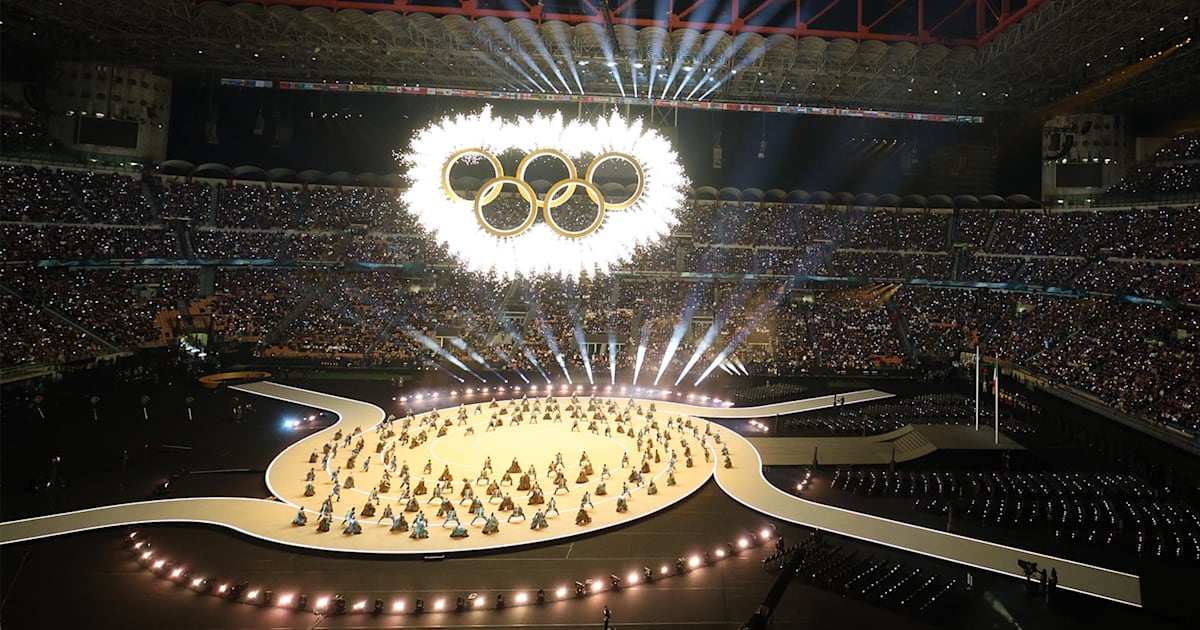
                      Comment


                      • #86
                        It's kinda amusing--you can tell what era many of those logos came from, throughout history:
                        Official home of the IOC. Find the latest news and featured stories, information about IOC members plus Olympic principles, values and legacy.


                        Atlanta's bid logo was very clearly made during the 80s, trying to avoid those unsightly excesses that London's game logo seeks to employ.

                        Generally, the non-stuffy ones start in 1960-but these are all games logos. I have no idea about the bid logos.

                        The problem with the 2012 Olympic Games logo is that I fear that it will not age well--it seems as if they're counting on the 80's to come back; while there's a chance of that, I doubt it will really be huge, since we've already had the "I love the 80s" shows.
                        B♭3

                        Comment


                        • #87
                          Originally posted by Q Cubed
                          Atlanta 1996 bid:
                          ZOMG! Teh unholy inverted sign of 666!

                          Comment


                          • #88
                            Actually, now that I look at previous bid logos... (Athens 2004, for instance, or Melbourne 1996, Manchester 2000, or Quebec 2002)


                            ...the more I think that the request that Chicago 2016 change its bid logo because of its similarity to a torch is stupid, and must be a recent rule.

                            B♭3

                            Comment


                            • #89
                              That Chicago logo
                              Blah

                              Comment


                              • #90
                                Originally posted by Cort Haus

                                Yes, Basra was a roaring success.
                                Hong Kong wasn't bad.

                                Dr. Sun Yat Sen asked himself why the Chinese couldn't have done it.
                                Vive la liberte. Noor Inayat Khan, Dachau.

                                ...patriotism is not enough. I must have no hatred or bitterness towards anyone. Edith Cavell, 1915

                                Comment

                                Working...
                                X