Announcement

Collapse
No announcement yet.

need opinions on design for a game project.

Collapse
X
 
  • Filter
  • Time
  • Show
Clear All
new posts

  • need opinions on design for a game project.

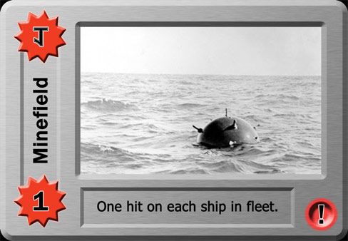
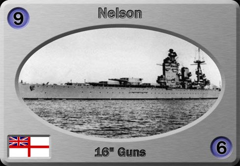
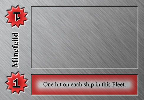
    i've been working on a revamp and redesign of avalon hill's classic game Naval War! for a few years now, and i've come to a point where i need some outside input as to what looks best.

    [first generation]
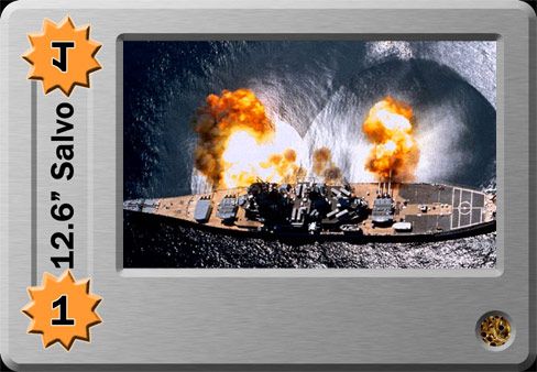

    for those that remember the old 'business card' decks, this is a vast improvement over the original. i took the design one step further, and with a conscious effort to be more conservative with the bevel/emboss effect.

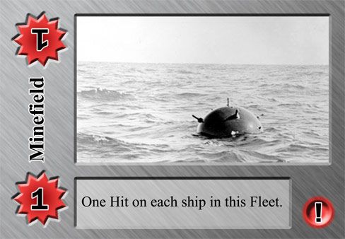
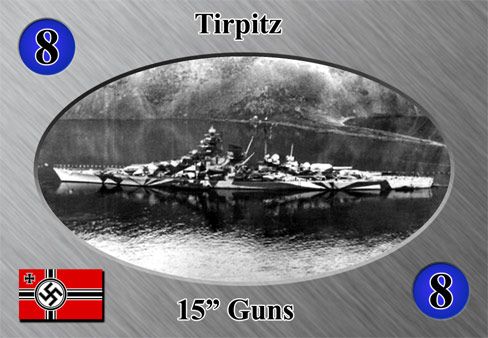
    [second generation]
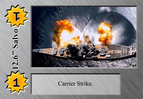

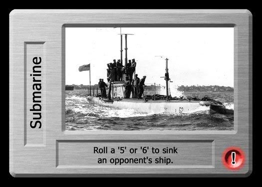
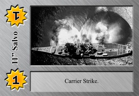
    without getting too much into the game mechanics, the original printing had certain play cards printed in red ink that had to be played the turn they are drawn. i originally put the red circle with an exclamation point to denote these 'red cards' and used another icon to denote regular play cards. the arrangement looks untidy to my eyes these days. a separate icon is extra information that isn't strictly necessary, and it also interferes with the text box being the same width as the picture.

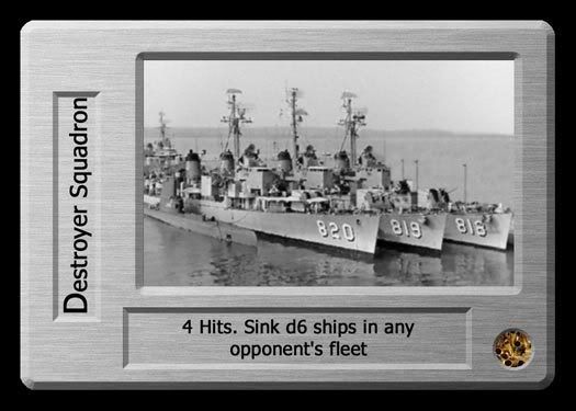
    but what would be a good way to identify the 'red cards' from the play cards? before you ask, there are cards that don't have the red/yellow damage icons, which are presented below.
    I wasn't born with enough middle fingers.
    [Brandon Roderick? You mean Brock's Toadie?][Hanged from Yggdrasil]

  • #2
    This is to be a physical printing?
    Apolyton's Grim Reaper 2008, 2010 & 2011
    RIP lest we forget... SG (2) and LaFayette -- Civ2 Succession Games Brothers-in-Arms

    Comment


    • #3
      yes. my masters are at 1200 dpi, if you were wondering.
      I wasn't born with enough middle fingers.
      [Brandon Roderick? You mean Brock's Toadie?][Hanged from Yggdrasil]

      Comment


      • #4
        Well, they look all nice and pro to me. Just one thing (and yeah, of course it has to be me again, to point out such a thing): If those are to be exported to Germany ever, you will need to remove the swastika. I suggest you use the ´Balkenkreuz´ instead in that case.

        Comment


        • #5
          I can understand why Germans would want to censor Nazi symbols but the application of the law manifests itself in strange and stupid ways.

          Play the German version of Return to Castle Wolfenstein to get an idea. All they did was remove the Nazi flags and Hitler portraits, changed Himmler's name, and called the Nazis, "Wolfsclan" instead. Yet it was still obvious they are supposed to represent the 3rd Reich. Really, what is the point of that?

          Comment


          • #6
            it's historically accurate. that was germany's naval ensign at the time.

            someone suggested altering the color of the text box, and i can do a red fade along the border of the text box.
            I wasn't born with enough middle fingers.
            [Brandon Roderick? You mean Brock's Toadie?][Hanged from Yggdrasil]

            Comment


            • #7
              Well, sb, of course it´s histroically correct, i know this. But you simply wont be allowed to import them like that. And please: Dont ask me for the reason - it´s simply to prevent any possible form of Nazi-propaganda. I personally have no issue with the cards at all - it was more meant as a business advice.

              Comment


              • #8
                uhm. dully noted?
                I wasn't born with enough middle fingers.
                [Brandon Roderick? You mean Brock's Toadie?][Hanged from Yggdrasil]

                Comment


                • #9
                  I find the mix of B/W and color (12.6 Salvo) photos a bit odd.

                  I like the debossed look. I think the mix of typefaces and type treatments (notably the outline in Gen2) is too cluttered.

                  Why not just make the red cards, red (or red-over-grey)?
                  Alternately, you could use the upper-right corner, adding a red-over-grey look in a triangle shape (coloring only the "top" - not "down" into the main illustration area). I'm thinking about an inch or so out from the corner, creating a right triangle.

                  Not sure where you're going here... I like the look, am slightly partial to the 1st gen set.

                  Oh, and the upside-down numbers are really annoying.
                  Apolyton's Grim Reaper 2008, 2010 & 2011
                  RIP lest we forget... SG (2) and LaFayette -- Civ2 Succession Games Brothers-in-Arms

                  Comment


                  • #10
                    because the photo was in color, wheras all my ships are WWII era photos and mostly in black and white. would it look better desaturated?

                    the upside down numbers are unfortunately crucial to gameplay. having them makes it far easier to read.

                    i'm not sure what you're saying with regards to the mix of typefaces. i largely regard the second generation Ship to be complete.

                    i've done some toying around with the layouts of the play cards and here's the result:

                    I wasn't born with enough middle fingers.
                    [Brandon Roderick? You mean Brock's Toadie?][Hanged from Yggdrasil]

                    Comment


                    • #11
                      Looks pretty good.

                      JM
                      Jon Miller-
                      I AM.CANADIAN
                      GENERATION 35: The first time you see this, copy it into your sig on any forum and add 1 to the generation. Social experiment.

                      Comment


                      • #12
                        Aren't those photo's copyrighted?
                        be free

                        Comment


                        • #13


                          Would be better if the ship in question was, in fact, a carrier.

                          ACK!
                          Don't try to confuse the issue with half-truths and gorilla dust!

                          Comment


                          • #14
                            May that ship is the one being struck, not the one striking?

                            Comment


                            • #15
                              Originally posted by Unimatrix11 View Post
                              Well, sb, of course it´s histroically correct, i know this. But you simply wont be allowed to import them like that.
                              It's totally inconsistent, in some uses they allow it (example hist. movies etc). Personally I think that maybe after over half a century after stuff happened teh Hitler would not rise again if they just abolished the silly law, since it also has some stupid side-effects.
                              Blah

                              Comment

                              Working...
                              X