The Altera Centauri collection has been brought up to date by Darsnan. It comprises every decent scenario he's been able to find anywhere on the web, going back over 20 years.
25 themes/skins/styles are now available to members. Check the select drop-down at the bottom-left of each page.
Call To Power 2 Cradle 3+ mod in progress: https://apolyton.net/forum/other-games/call-to-power-2/ctp2-creation/9437883-making-cradle-3-fully-compatible-with-the-apolyton-edition
Older Civ2 versions, i.e. pre-ToT only use Times New Roman everywhere in various font sizes (except where your standard Windows fonts are used, such as for the menus).
ToT uses Arial and Times New Roman (and whatever Windows uses for its dialogs and menus). I don't know exactly which is used where, but it's easy enough to spot the difference.
Oh, there's another font too, I think. It's used next to text boxes, e.g. "New treasury:" next to the "Change Money" thing. I think that's either MS Sans Serif or Arial (bold). This is the same in all versions of Civ2.
I think only the font sizes are dependent on computer settings.
Maybe Harry, but I'm not sure. Looks like this one might be easier to investigate than ask.
Since I thought I recognized Times New Roman in the Defense Advisor's report, I did a string search in Civ2.exe. Came up with one instance each of:
Times New Roman,
Arial,
Courier, and
System.
Mostly makes sense, since these are common fonts. The letter shapes in most dialogs match Arial, but something's quirky. When I try to work out text alignment of a dialog in Game.txt using Arial (Windows Western) in WordPad, it isn't always wsiwyg, especially if I use characters with codes > 127. When I use a series of —'s, i.e. [Alt-151], in a dialog as a separator, the spacing in WordPad doesn't seem to match the spacing in a dialog at all.
My system settings currently use Verdana, Comic Sans MS, and Verdana Ref. In a quick survey, I didn't recognize any of these in ToT dialogs.
Totally OT here but ... @ Martin, Boco: I think the whole phrase is "Hic et nunc in omnia paratus" which equals more or less "Here and now prepared for everything".
Jeez, now these Latin classes in school (6 years) finally paid off
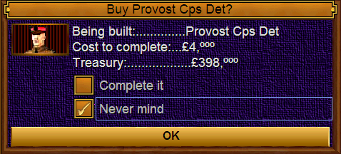
Here's some alignments of the same 3 lines of text.[list=1][*]The appearance in ToT.
[*]Here's the text displayed as Arial on 'Poly size 3
^Being built:..............%STRING0
^Cost to complete:...£%NUMBER0,ººº
^Treasury:..................£%NUMBER1,ººº
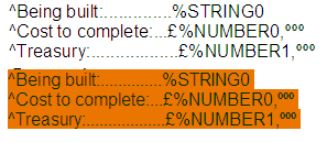
[*]'Poly regular size
^Being built:..............%STRING0
^Cost to complete:...£%NUMBER0,ººº
^Treasury:..................£%NUMBER1,ººº
[*]Here's how Arial size 12 is displayed in MS Word (top) and WordPad (bottom).
[/list=1]
This may be a well-known distortion, but it's news to me. I never knew relative spacing of periods (and other punctuation) depended on application and size. What happened to wysiwig! Looks like the most ToT-like rendition of Arial in WordPad is 10 point.
 Tweet
Tweet
 Maybe Harry, but I'm not sure. Looks like this one might be easier to investigate than ask.


 [/list=1]
 Looks like the most ToT-like rendition of Arial in WordPad is 10 point.
Comment