 Tweet
Tweet

-
Formerly known as "CyberShy"
Carpe Diem tamen Memento Mori -
I kind of liked the plain box (the temp art) better.

They always try to make Civ look like such a wargame. I suppose I'm in the minority of players but I hate waging war in Civ.
I wished they emphasized other stuff besides war.
For example, take this cover:

Yeah there's fighting in the background and the guy in the front is a soldier but the Phoenician and Egyptian do not express anything warlike and really emphasize what you think of as civilization, not rampaging warriors. (though AoE is more of a wargame than Civ obviously, they still wanted to represent other things on their cover)Last edited by Al B. Sure!; July 29, 2010, 18:28."Flutie was better than Kelly, Elway, Esiason and Cunningham." - Ben Kenobi
"I have nothing against Wilson, but he's nowhere near the same calibre of QB as Flutie. Flutie threw for 5k+ yards in the CFL." -Ben Kenobi -
The foreground focusses on war indeed, but the background (50% of the image!) focusses on wonders of the world!
Opera House is in? Sears Tower? Big Ben? Tower of Pisa?Formerly known as "CyberShy"
Carpe Diem tamen Memento MoriComment
-
yeah but who notices that in that hazy blue background? The flashes of muzzle fire from all the soldiers, artillery, and the warship is what strikes you first."Flutie was better than Kelly, Elway, Esiason and Cunningham." - Ben Kenobi
"I have nothing against Wilson, but he's nowhere near the same calibre of QB as Flutie. Flutie threw for 5k+ yards in the CFL." -Ben KenobiComment
-
I can't believe this, but I agree with Al. The basic black is much better."My nation is the world, and my religion is to do good." --Thomas Paine
"The subject of onanism is inexhaustable." --Sigmund FreudComment
-
I also like the basic black.
Robert: 1) There is no Sears Tower. 2) What used to be the Sears Tower isn't on the cover. Tutto nel mondo è burla
Comment
-
I definitely liked the plain black box better, especially for a game like Civ. Maybe a sandstone wall with hieroglyphs and the words Civilization V on it would have been even better. You want to express a certain timelessness with a game like Civ that is a game with such a large scope, doesn't have a story, doesn't have characters, etc. When I think of the word civilization, I don't think rampaging warriors. I think monuments, arts, culture, science, exploration, etc. I think a cover that is simple, subtle, with a stoic, mysterious allure would work so much better... a cave wall illuminated with the flashes of a flame... something like that.
Let's consider the AoE cover as comparison again. The Phoenician is holding scrolls and has his hand raised over his brow as if he is on the bow of a ship looking across the horizon. The Pharaoh gives off this regal air as if he's gazing upon his empire.
Also, look at some other covers from other games... Though it's a different type of game, take a look at this very good cover:

The faceless soldier dominates the image and his apparent ruggedness along with the blue-ish haze of a jungle night just has this 'cool' appeal to it. It's not as simple as the Modern Warfare covers (which are probably done a little bit better), but it's very good. There's the fighting in the background which makes it a little busy, but it's fairly subtle and is lost in the blue haze.
Now, the reason why I picked that cover is because you can check out the alternate covers considered by Activision:

What's wrong with those covers? 4 of the 5 are too busy. And the fifth, the one with the helmets and rifles, doesn't really convey what you want a game to convey; it doesn't elicit the idea that this game will be fun.
Can you see the similarity in the four rejected covers from Call of Duty compared to the one they went with and the Civ 5 cover? It's so much busy-ness! That is bad.
I don't know who they pay to design these things but I don't know what possesses them to want to cram so much onto a box cover.Last edited by Al B. Sure!; July 29, 2010, 20:18."Flutie was better than Kelly, Elway, Esiason and Cunningham." - Ben Kenobi
"I have nothing against Wilson, but he's nowhere near the same calibre of QB as Flutie. Flutie threw for 5k+ yards in the CFL." -Ben KenobiComment
-
Something like this:
 "Flutie was better than Kelly, Elway, Esiason and Cunningham." - Ben Kenobi
"I have nothing against Wilson, but he's nowhere near the same calibre of QB as Flutie. Flutie threw for 5k+ yards in the CFL." -Ben KenobiComment
-
Frankly, the basic black would stand out far, far, FAR more on store shelves than the way-too-busy cover they picked. It would really pop when compared to all the other boxes it'd be next to. Not only would it grab attention, it also looks more serious and dignified, which is what most Civ players would want. The box is pretty clearly an attempt to get new players, but I can't see it working."My nation is the world, and my religion is to do good." --Thomas Paine
"The subject of onanism is inexhaustable." --Sigmund FreudComment
-
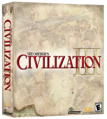
Hell yes, exactly. Civ3 sucked (in comparasion to Civ2 and SMAC before it, and Civ4 after it), but the box art was perfect. Understated, but attention grabbing.
The standard Civ4 box was too busy, but the CE was... basic black, with gold lettering. It looks ****ing gorgeous.
Before buying Civ5, one of the things I was waiting on was the box art. Now the only reason I can see to buy off the shelf would be if the manual is any good, but I doubt it. I'll probably just get it online from D2D."My nation is the world, and my religion is to do good." --Thomas Paine
"The subject of onanism is inexhaustable." --Sigmund FreudComment
-
The background looks good, the foreground looks like a modified screenshot from the game.- DregorComment
-
a picture is worth 1000 words, and this picture has the opportunity to add flavour to the gameSafer worlds through superior firepowerComment
-
being myself a professional ilustrator, I have to stay with the first one...
But I like the plain black box better.
Comment
-
The plain black was way better. I hope the guys who created this horror weren't payed too much and committed that in retaliation. Way too warlike and crowded, giving a sense of an anachronistic mix instead of evolution from stone age to modern times.Clash of Civilization team member
(a civ-like game whose goal is low micromanagement and good AI)
web site http://clash.apolyton.net/frame/index.shtml and forum here on apolyton)Comment
-
Add another vote for the black box. As mentioned, it would definitely stand out rather than looking like any other game on the shelf.
The black one looks sleek, sexy and proud.While there might be a physics engine that applies to the jugs, I doubt that an entire engine was written specifically for the funbags. - Cyclotron - debating the pressing issue of boobies in games.Comment
Comment