Announcement

Collapse
No announcement yet.

GRAPHIC: New Science Advisor Screen

Collapse
X
 
  • Filter
  • Time
  • Show
Clear All
new posts

  • GRAPHIC: New Science Advisor Screen

    FOR CONQUESTS
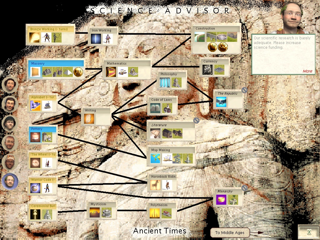
    I made these backgrounds for the science advisor screen.
    Each age has a background that portrays that age.
    Just unzip the zip file in your art\advisor folder
    Download the file here
    here's a preview of the ancient background.
  • #2
    Feedback; on the coloring to similiar washes out reading the techs. How about 'redening' the background to a little burnt orange?

    Anyways my thought on it.
    The Graveyard Keeper
    Of Creation Forum
    If I can't answer you don't worry
    I'll send you elsewhere

    Comment


    • #3
      I think it makes the screen look to busy. Sorry...

      Comment


      • #4
        I like the basic idea a lot, but the image is a bit over the top - as the two previous posters said, it makes the actual box contents too hard to read and distracts too much from the arrows between the boxes.

        Changing the color, as the first reply suggested, probably would not help enough with the "busy-ness", though it would at least make the data readable.

        The goal is to have the background still recognizeable when you focus your attention on it, but easy enough to ignore when you want the data the screen presents. Here are a couple of suggestions:

        1) Easiest to do is to use an image editor to significantly decrease the contrast of the background image. A decent freeware/shareware tool should let you do this.

        2) Even better, find some *line art* that represents the age you want instead of a photo-like image, and then decrease the contrast on that. Line art looks much better than photos when you kill the contrast.

        Comment

        Working...
        X